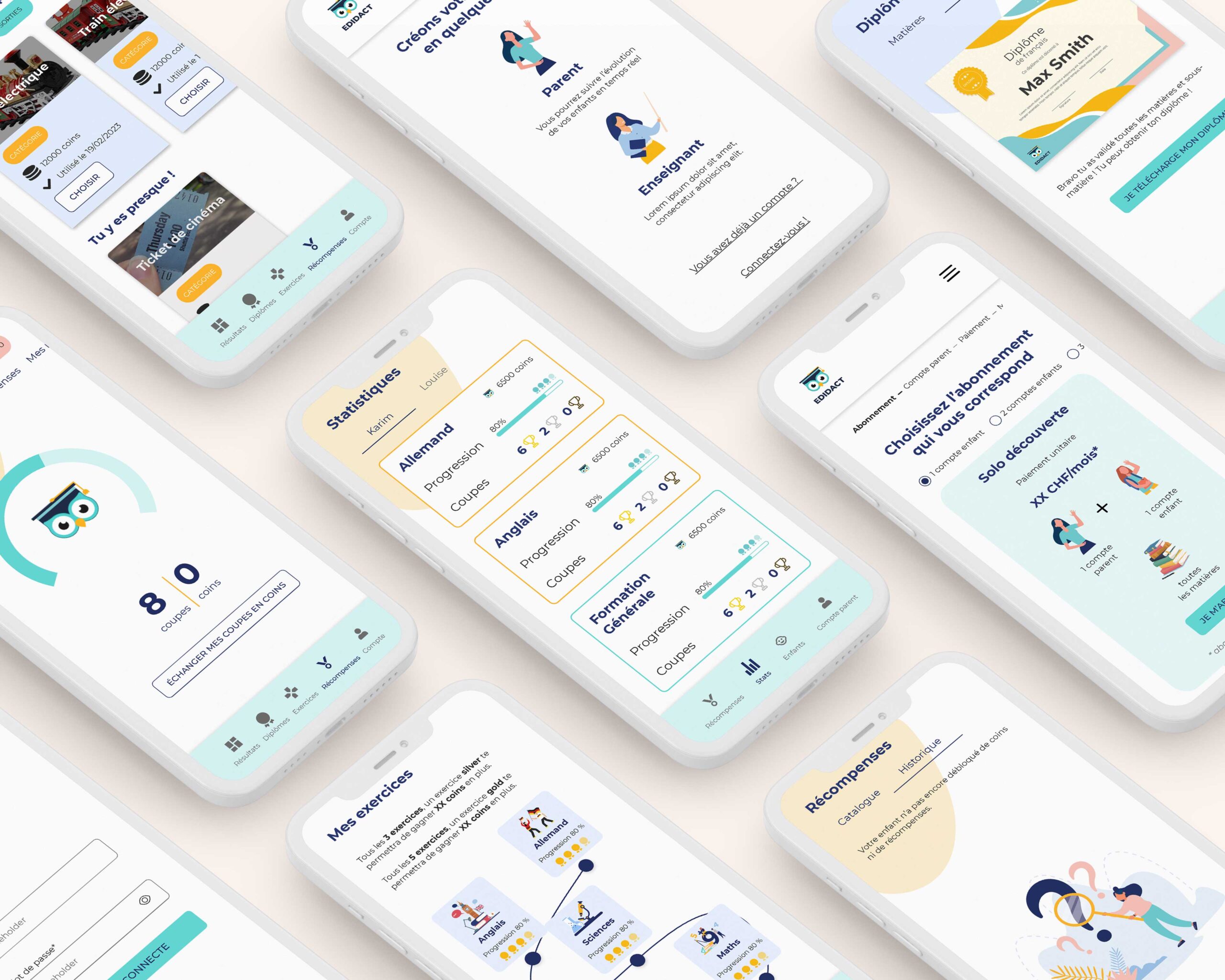
Creation of the Edidact mobile application
Context
Once the platform redesign was completed, Karim and I worked on the mobile application. We leveraged all the prior work to capitalize on what had been done and to be as efficient as possible.
Objective
To create the mobile application for the Edidact platform
Key project points
Project Management
User experience
Mobile application
User journey and navigation
We adjusted the various key user journeys to ensure they were suitable and aligned with mobile app conventions.
We refined the wording of each navigation tab to make them clearer and more understandable for users. We applied this wording to the platform for consistency.
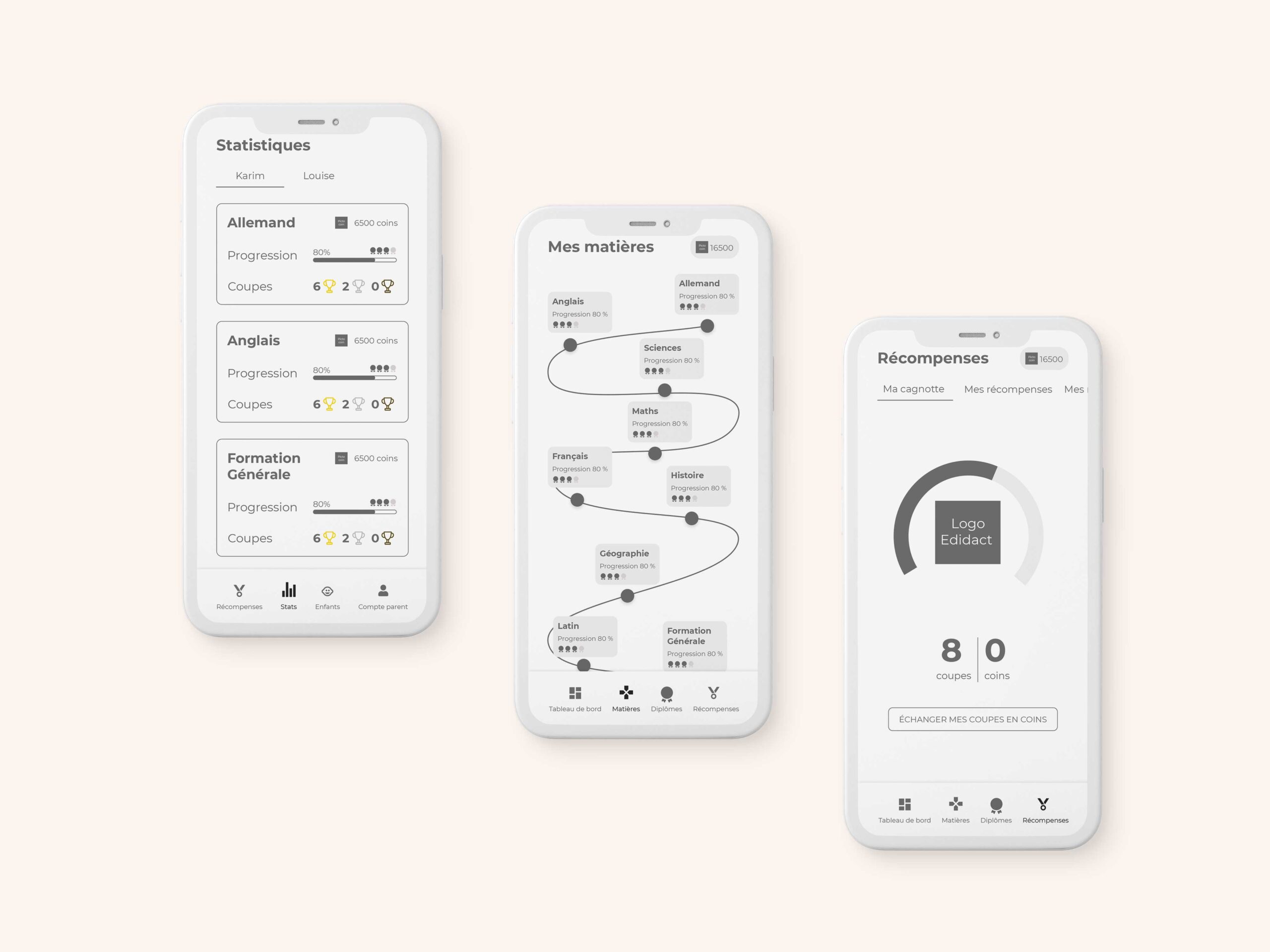
Once this work was completed, I moved on to wireframe design.

UX Design
To do this, I ensured to adhere to mobile conventions such as one action per screen.
I paid attention to ensure that the content was neither too large nor too small, and that action buttons were comfortably placed within the user’s reach.
Of course, I used the UI kit established earlier to create unity between the platform and the mobile application. I reused the same design codes from one tool to another to create a simple, intuitive, and consistent user experience.
Again, we approached this project iteratively.
I presented my various works to the team, and the development team leader was present to validate technical feasibility. In case of issues, I revised my proposal to ensure it could be achieved within the given time frame and was technically feasible.
UI design
