Redesign of the Edidact platform
Context
It was an exciting, challenging, and very comprehensive project!
I worked on the redesign of the web platform with a dark mode design variation and the creation of the mobile application.
There is a third user on which I did not work: the teacher. Indeed, the teacher can create an account and use the platform. The scope of my action focused on parents and children.
The main challenge was to optimize the user experience from registration to platform usage to establish itself in the French and Francophone markets while standing out from the competition.
Problem statement
How to optimize the user experience from registration to platform usage?
Key project points
Project management
User experience
SaaS
Responsive design
Onboarding
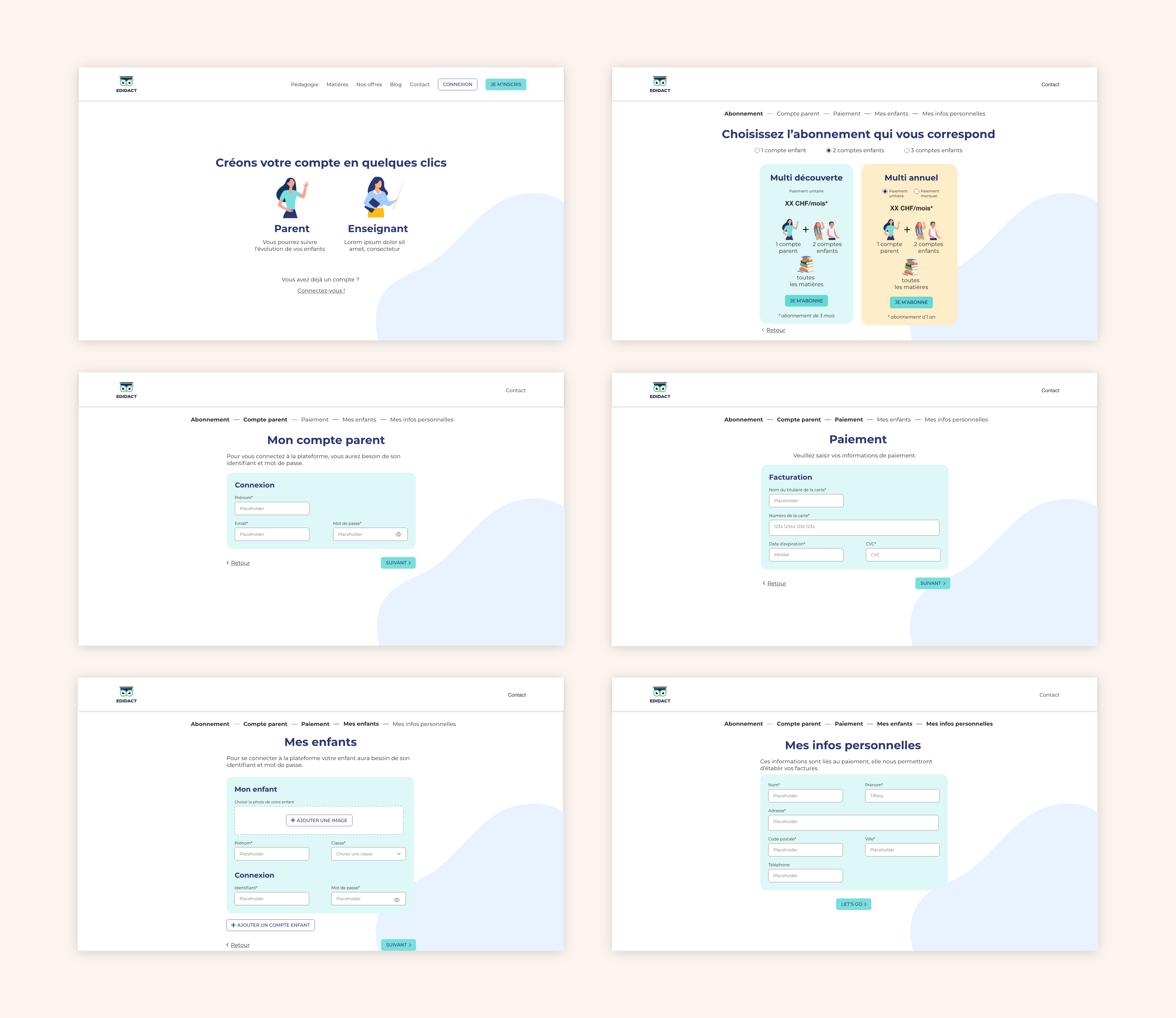
The user could choose a subscription based on the number of child accounts they wanted. This choice was complex, not intuitive, and the user didn’t really understand what they had access to.
So, there was a lot of work on:
- Prioritizing the information requested during onboarding
- Sorting through the type of information requested in the different forms to focus on the essentials and thus increase conversion rates
- Presenting the different subscriptions while simplifying the choice of the number of child accounts to create
- The content explaining the different offers and the form to convert users into customers

User Journey and information architecture
Thanks to his business knowledge and my technical knowledge, we:
- Identified and named the different tabs
- Defined the different user journeys for the platform’s key features
- We laid the foundations of the new platform
- I had my list of screens to create for the wireframe design
Thus, we identified the blocking points and inconsistencies that we solved together.
Thanks to this workshop:
This allowed me to move forward more quickly on the project while involving the client and his teams.
3 Conception UX
For the parent space, there were two projects:
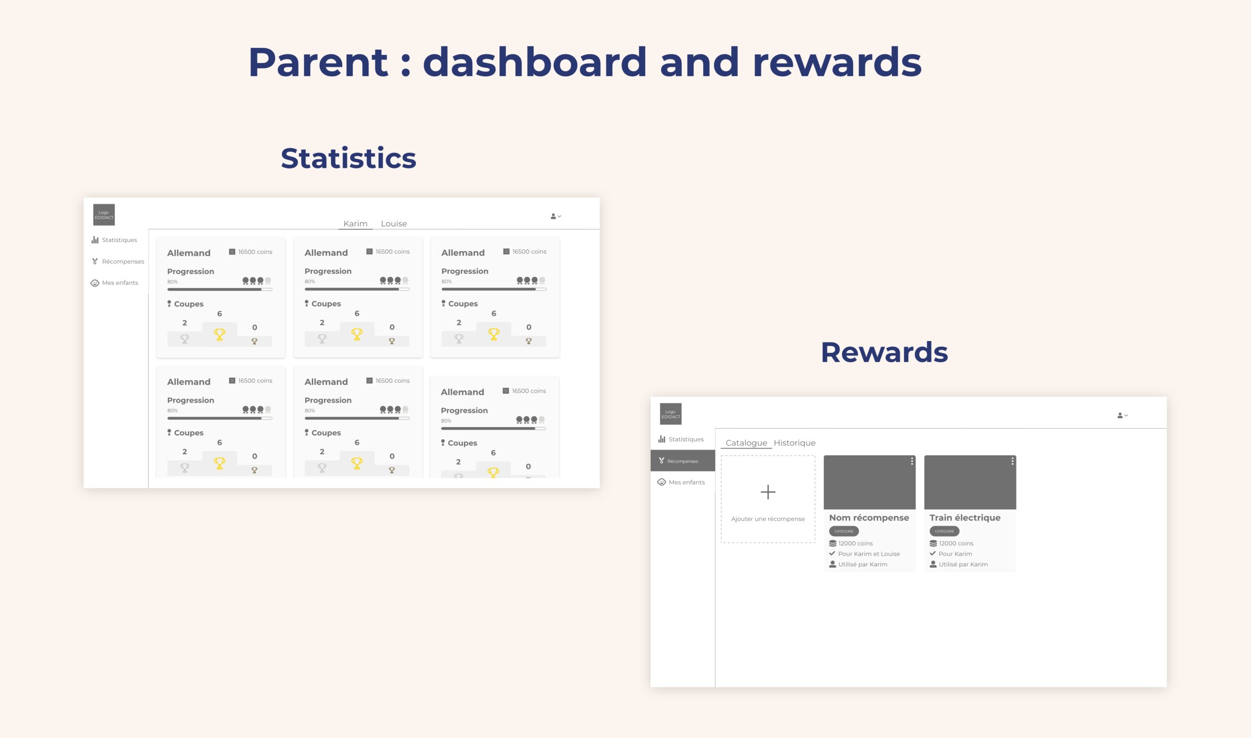
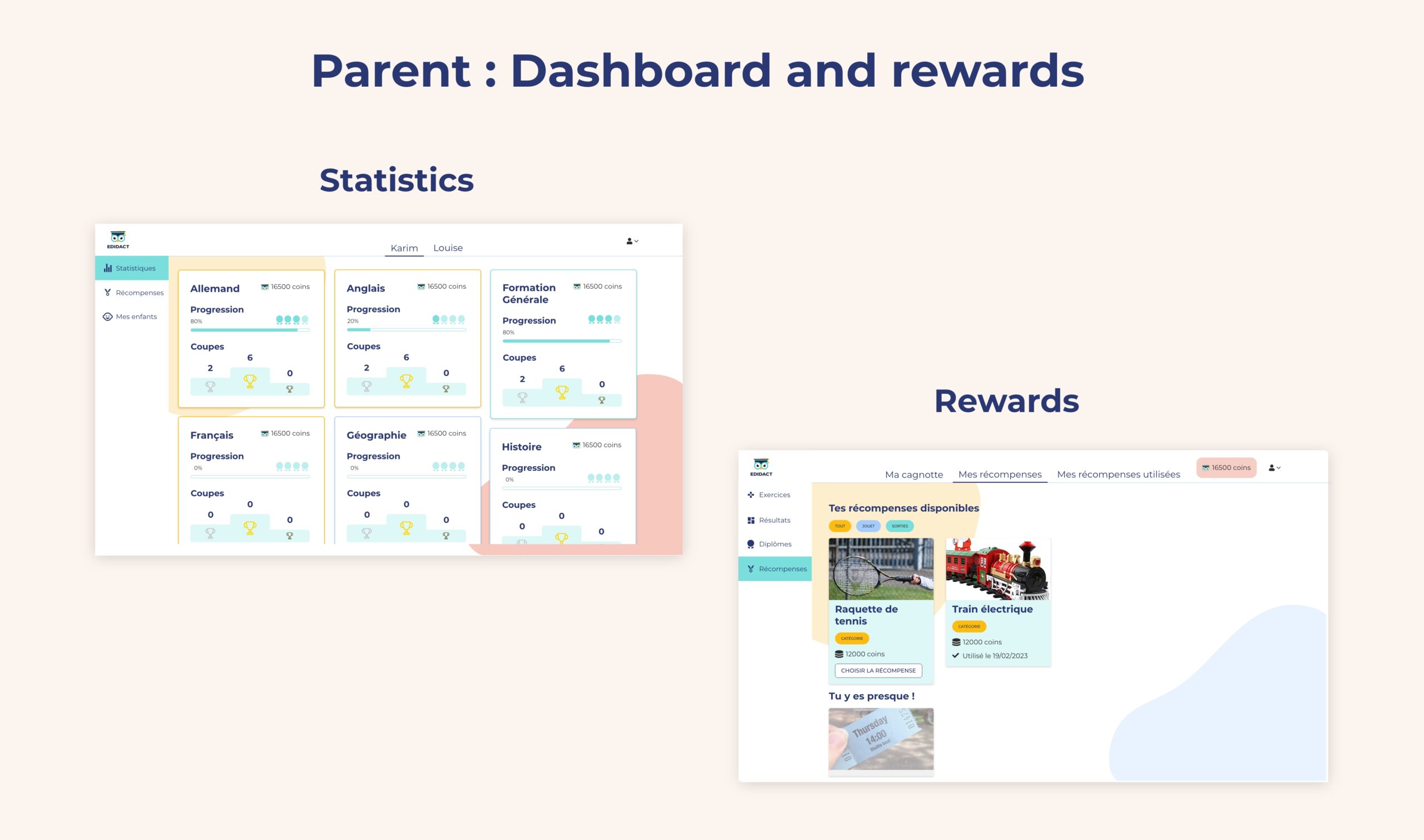
- Designing the dashboard to visualize the progress of their children
- Managing rewards (a focus on gamification is made further down the page)
For the dashboard, I gathered all the essential information to know:
- The subject
- The progress
- The number of cups won
- The number of coins
- Board view with aligned cards
- Game board view where I was inspired by the card present on Duolingo
Once the information was identified, I created a map by structuring the information.
For reward management, I set up a form accessible from the page grouping all rewards.
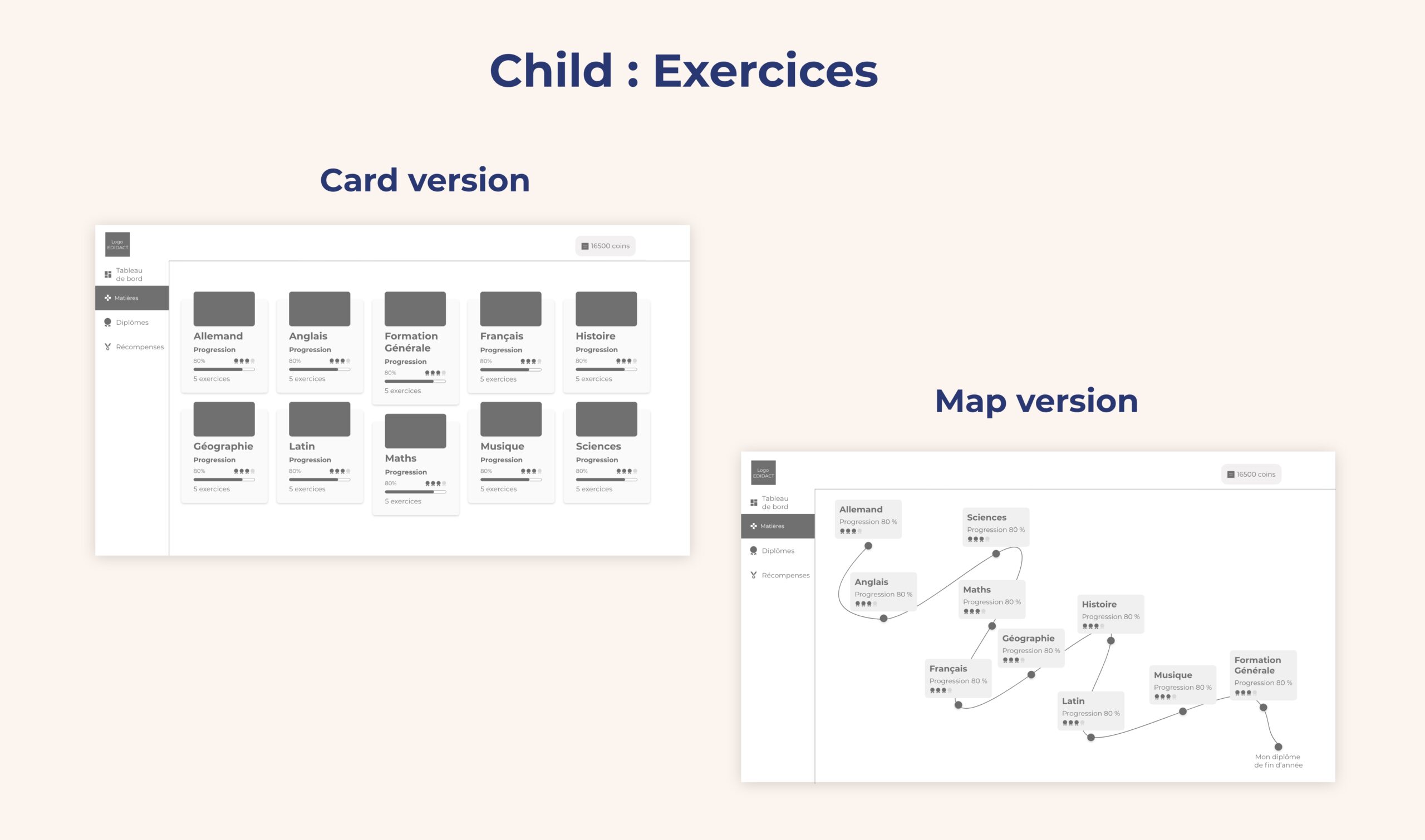
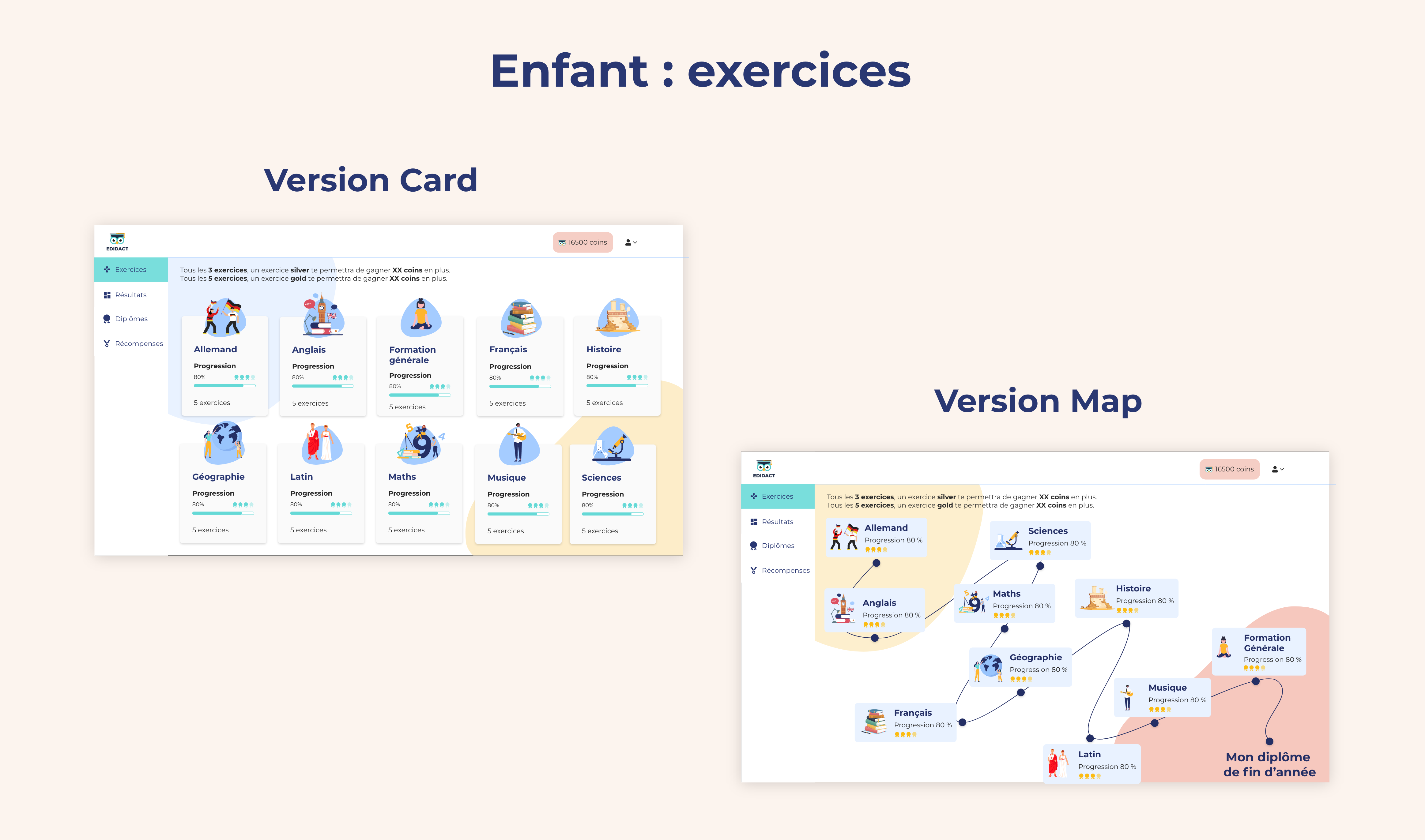
For the child space, there was a major project on the exercise part. It was necessary to make access to and completion of exercises simple, visual, and attractive so that children stay and play. For that, I chose to present this interface in two ways:
So, thanks to an icon, the user can switch from one view to another and choose the one that suits them best.
In parallel with this UX reflection, I started to set up a UI kit to harmonize and standardize the different graphic elements allowing me to build the interfaces. I created the different components according to my needs.
We conducted this project iteratively. During the presentations and validations phase of the different screens, the head of the development team was there to ensure technical feasibility and thanked me for setting up the UI kit. Thanks to him, his teams saved time on the development part. They were able to start development once the wireframes were validated. The graphic layer arrived later.
UI design
- Proposal of two mood boards
- Declination of the chosen universe on a few key screens
- Declination on all interfaces
For the mood board proposal, I started with two different proposals to leave the choice to Karim.
To create his graphic universes, I exchanged with Karim first. He wanted a fresh, dynamic universe but not too childish. I based myself on the existing color palette while taking into account his request. I made two proposals and he chose a mix of the two proposed universes.
Once the graphic universe was chosen, I applied it to a few key interfaces and then to all interfaces.
Gamification
It consists of two components:
- Parents add rewards by indicating the number of points required to unlock them
- Children earn points to access these rewards
I drew inspiration from gaming applications such as Duolingo to incorporate this aspect into the application.
Dark mode
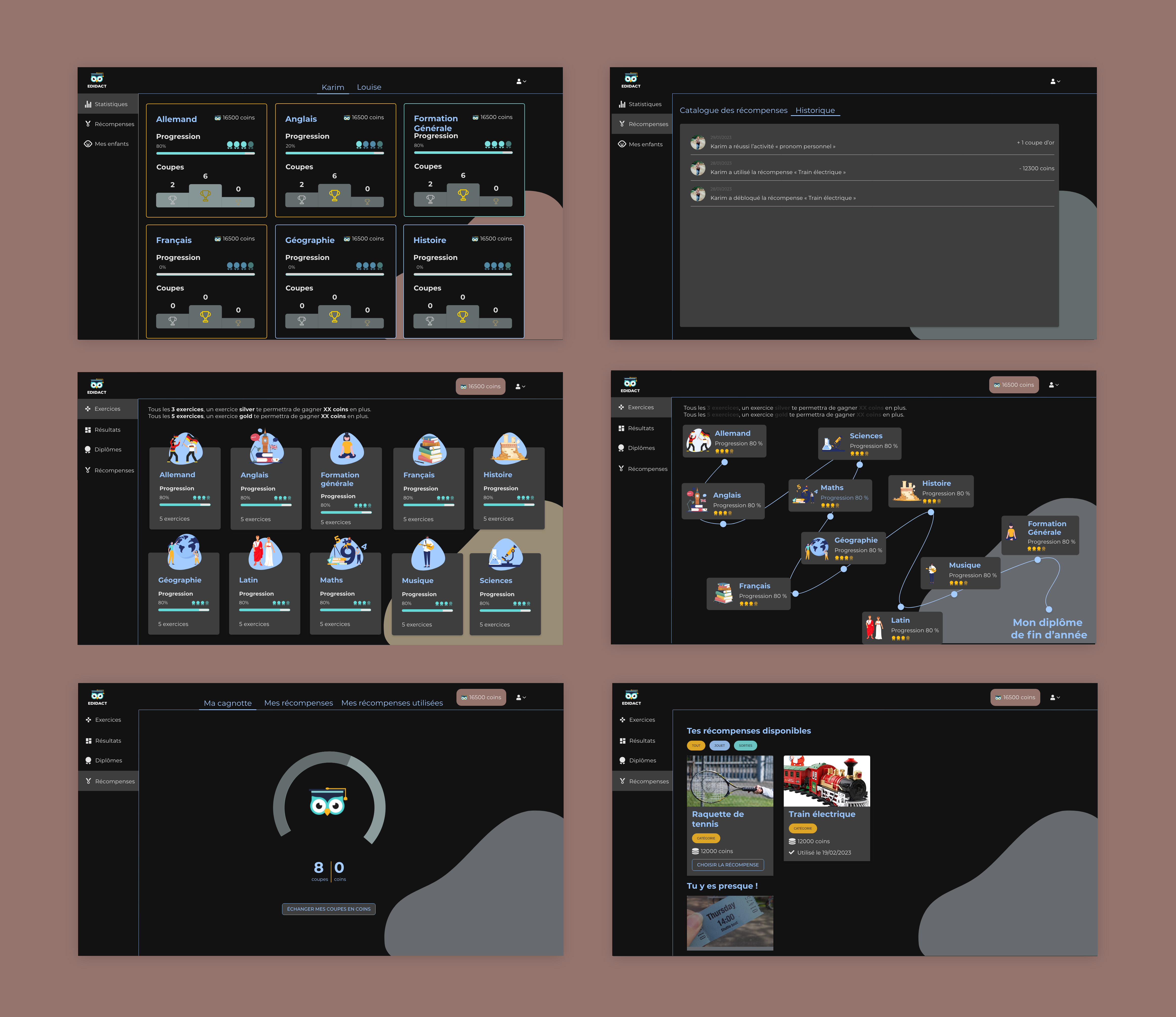
To create an even more immersive user experience, we chose to create a “dark mode.”
Please note: Dark mode is not just about putting interfaces in shades of black; it’s a bit more complex than that!
I therefore reworked all the interfaces to make them as immersive as possible. I played with colors to highlight important information, such as titles. I used shades of black to bring out graphic elements like cards while adhering to the principles of the dark mode.
Project management
To achieve this, I created a shared space with the entire Edidact team on Notion, where I centralized all the important information.
This included:
- The project’s retroplanning
- Meeting minutes to keep a record of modification requests and validated choices
- Links to wireframes, mood boards, and mock-ups
- An exchange area to avoid getting lost in emails

