Conception of the Astrid software for Air France

Context
Air France, the French airline company, enlisted my expertise to work on a part of the Astrid project. I collaborated with the in-house designer and the entire project team in an agile mode.
Astrid is a business software for managing airplanes at airports. It is the integration of several existing tools. The existing software was not at all ergonomic and intuitive. They were developed in the 90s and were not user-centric. However, users were accustomed to these tools. Their integration would allow users to centralize data, streamline their work, while optimizing the user experience.
Due to confidentiality reasons, I cannot showcase the screens created.
Problem statement
How to merge multiple tools into one while optimizing the user experience?
Key project points
Business application
Adherence to the company’s graphic charter
B2E project (business to employee)
Utilization of the Angular framework (development)
Thorough understanding of end-user needs
This collaborative work highlighted different types of users: people on the tarmac, working day and night and in all weather conditions, people working in the airport with a “wall” of screens in front of them (I counted up to 8 screens). This diversity of users is a crucial factor in the success of this project. The application needed to be accessible, intuitive, and ergonomic to meet everyone’s constraints.
This phase of research and analysis allowed me to clearly identify the tool’s action fields under construction.


Structuring Functional Screens
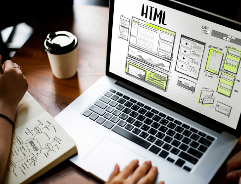
Through this work, I translated functional needs into wireframes by applying ergonomic principles and usability criteria.
There was significant work with forms. It is always a delicate element to work with. It can quickly become very dense and non-ergonomic. Its structuring is therefore important. It is necessary to carefully consider the placement of different fields, group information into coherent blocks, etc.
Applying the Graphic Universe to Interfaces
The goal was to use colors to structure the screens, facilitate readability, highlight key information and actions, and thus optimize the user experience.

