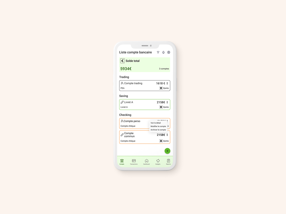
Creation of the Mobile App The French Enveloppe

Context
Thomas started with an observation: in France, financial education is not widespread.
Most people save and would like to do more, but don’t really know where to start. This is how the idea for the mobile app The French Enveloppe was born. It is based on the principles of zero-based budgeting and uses the envelope system to allocate money into different categories. An educational component aims to raise awareness and educate users on financial management.
Objective
Create the MVP of the mobile application
Key project points
Mobile application
User experience
MVP
UI kit
Creation of user flows
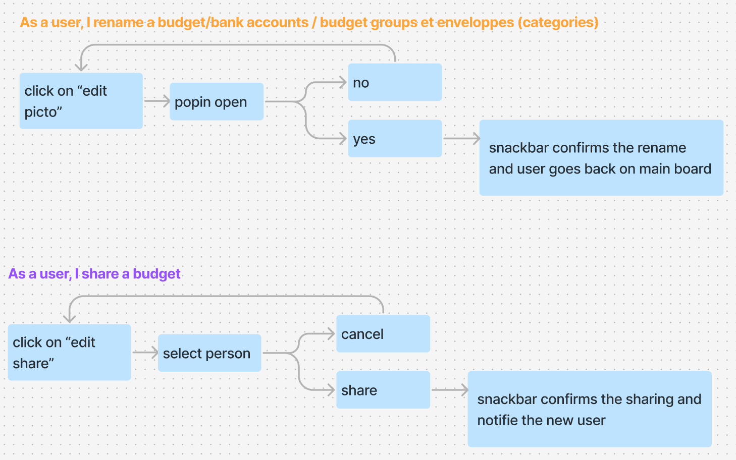
Based on the features provided by Thomas, I identified all the use cases for the application.
Through the “task flow” workshop, we identified all the actions needed to accomplish each use case. I then created patterns to ensure a consistent user experience across the entire app.
This process answers questions like: what are the fields for this form? Which ones are mandatory, etc.?
At the end of this work session, the various user flows were validated, and the wireframing phase could begin.
The central element: the cash flow
Have you ever seen a cash flow?
It might look something like this:
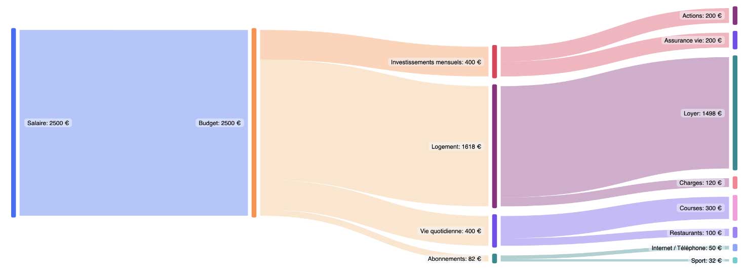
Well, on a mobile device, this view is impossible and unreadable.
We had to find a solution to display the information in a readable and relevant way.
This is where I stepped in.
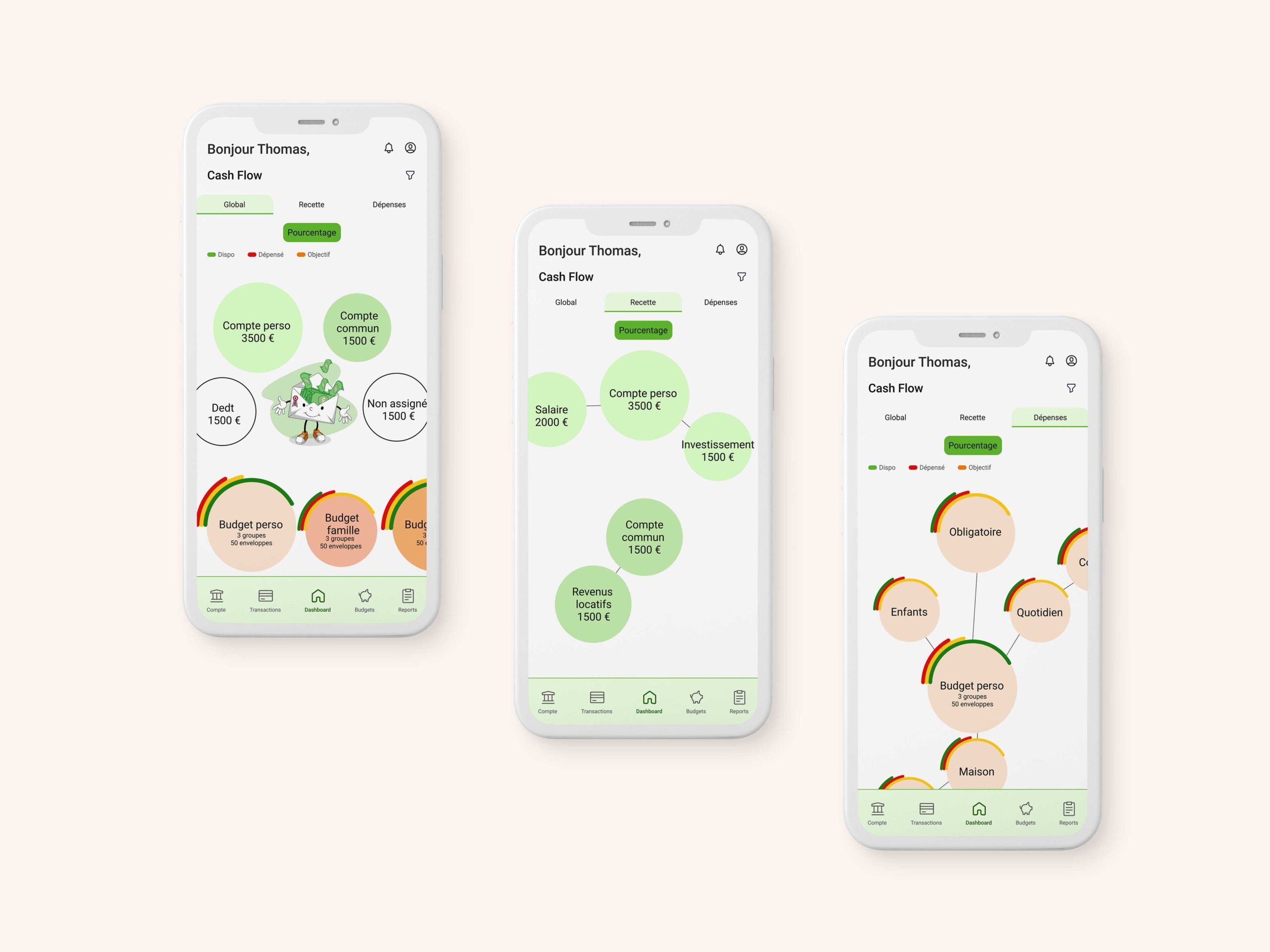
I proposed a 3-in-1 view:
- A global overview
- An income view
- An expense view
With the global view, the user sees all of their banking transactions.
For each budget, they see:
- The financial goal
- Available funds
- Spent funds.
This way, they know exactly where they stand.
In the expense view, they get additional information. It provides a more detailed view of their expenses based on each budget, group, and envelope they defined when creating their account. Thanks to this view, they can manage their spending more precisely.
Budget details
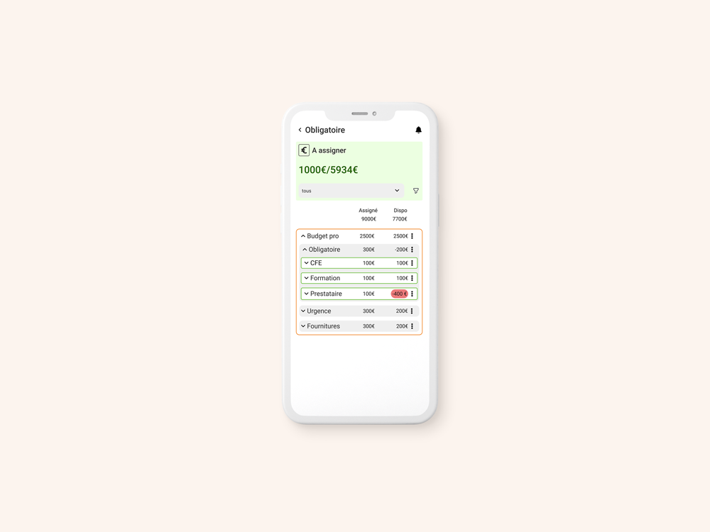
By clicking on a bubble, they can see the details of their banking transactions. Once again, the challenge is the amount of information to display.
Structuring the information pragmatically was the main challenge for this screen.
I collaborated with my client to determine:
- What are the important vs. secondary details?
- What is the purpose of this screen?
- What actions can be performed here?
- etc.
This research, along with iterations and best practices, led me to this final result.
The budget’s financial goal and available funds are displayed first.
Within each budget, the user can quickly identify groups and envelopes with their assigned and available funds. Envelopes that lack money are highlighted with a red background, while surplus envelopes are highlighted in green.
The educational aspect
The educational part is accessible once logged into an account.
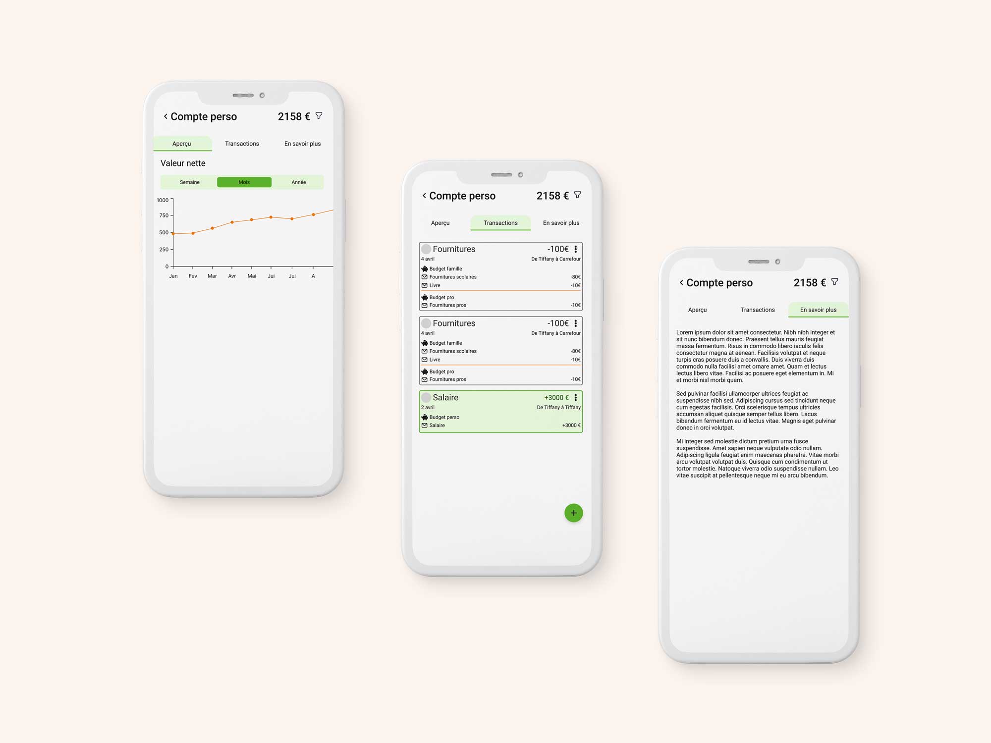
Here, users can see the transactions that took place: money in and money out. Again, a green background identifies an incoming transaction. This visual cue aids readability. The “+” sign before the figure is another indicator of the transaction type. It’s essential not to rely solely on a visual cue to convey information.
In the “Learn More” section, users find information tailored to their account and situation. These tips are designed to help them manage their finances and achieve their goals, among other things.
