Creation of the website for Tolma,
a law firm specializing in Startups, Freelancers, and SSE

Context
She didn’t want a traditional website like all other law firm sites. She wanted something that reflects her personality and breaks the norms. Hence, she aimed to create a strong and colorful brand identity, with a website showcasing her services while highlighting her values.
Objectives
Develop a dynamic website for the Tolma law firm and highlight different ideal clients
Key project points
Project and team management
Collaboration and teamwork
Responsive design
Creation of a graphical universe consistent with the brand guidelines
Project and team management
There were 4 main stakeholders in this project:
- Paola Iannucci, the art director and WordPress integrator
- Julie Barthélémy, the copywriter
- Cindy Hérault, the client, and her collaborator Anouk Barba
- Myself, responsible for website design and project management
A schedule was put in place so each team member worked on the project at different times. We collaborated closely because each aspect impacted the work of another.
Unexpected events arose during the project, but good communication allowed us to manage them effectively. I adjusted the schedule accordingly, and the project proceeded smoothly.


Competitive analysis and information architecture
This helped us understand her needs, goals, and desired direction.
After a research and analysis phase, we created the information architecture.
The key point of the architecture was to clearly display the 3 target users: startups, freelancers, and social and solidarity enterprises.
Therefore, we decided to create a separate page for each target user.
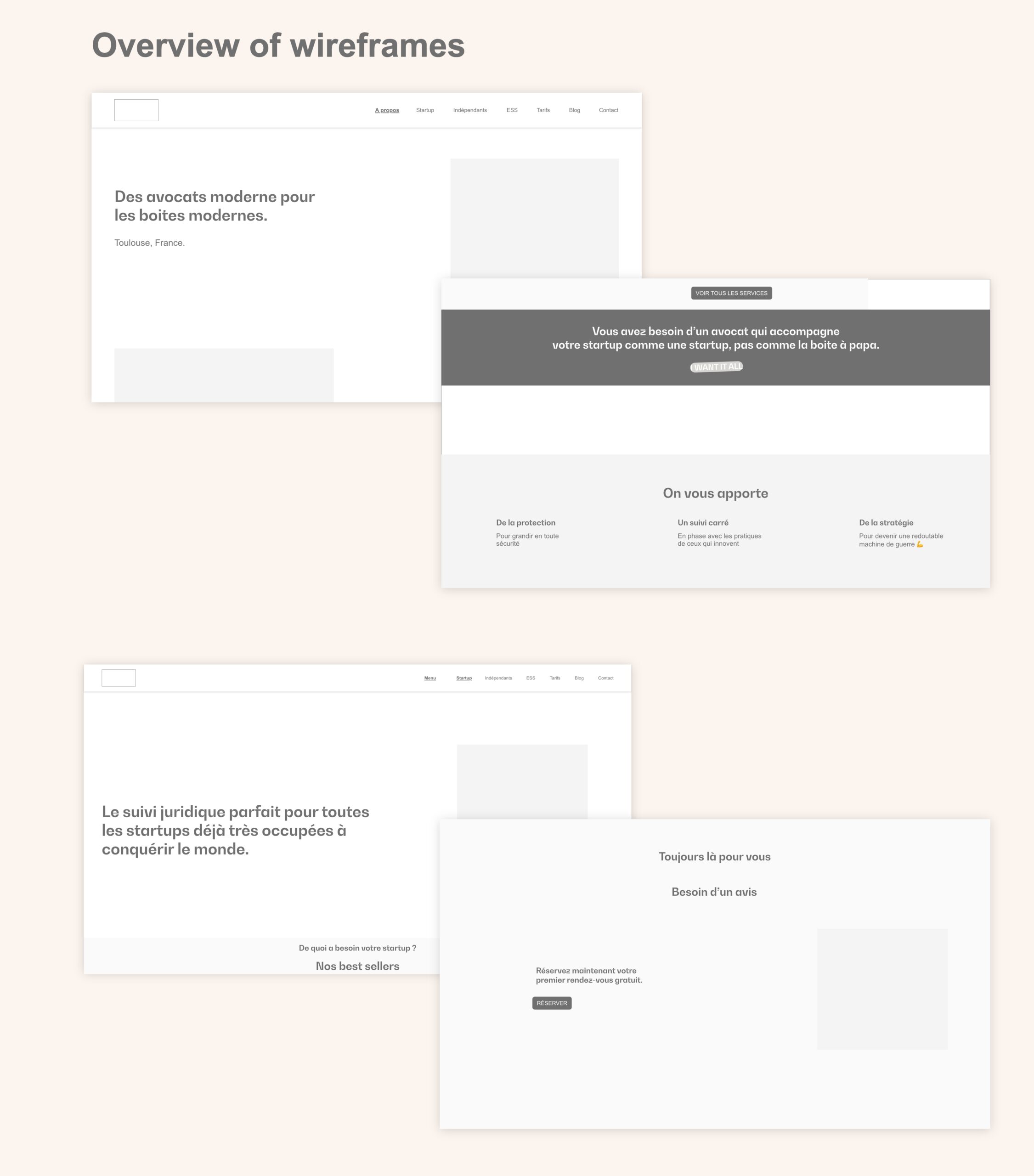
Screen structure
She was responsible for writing the text, which greatly aided me in designing the screens.
We quickly identified the important elements and highlighted them.
Once the structure of the different screens was validated, I moved on to designing the site.


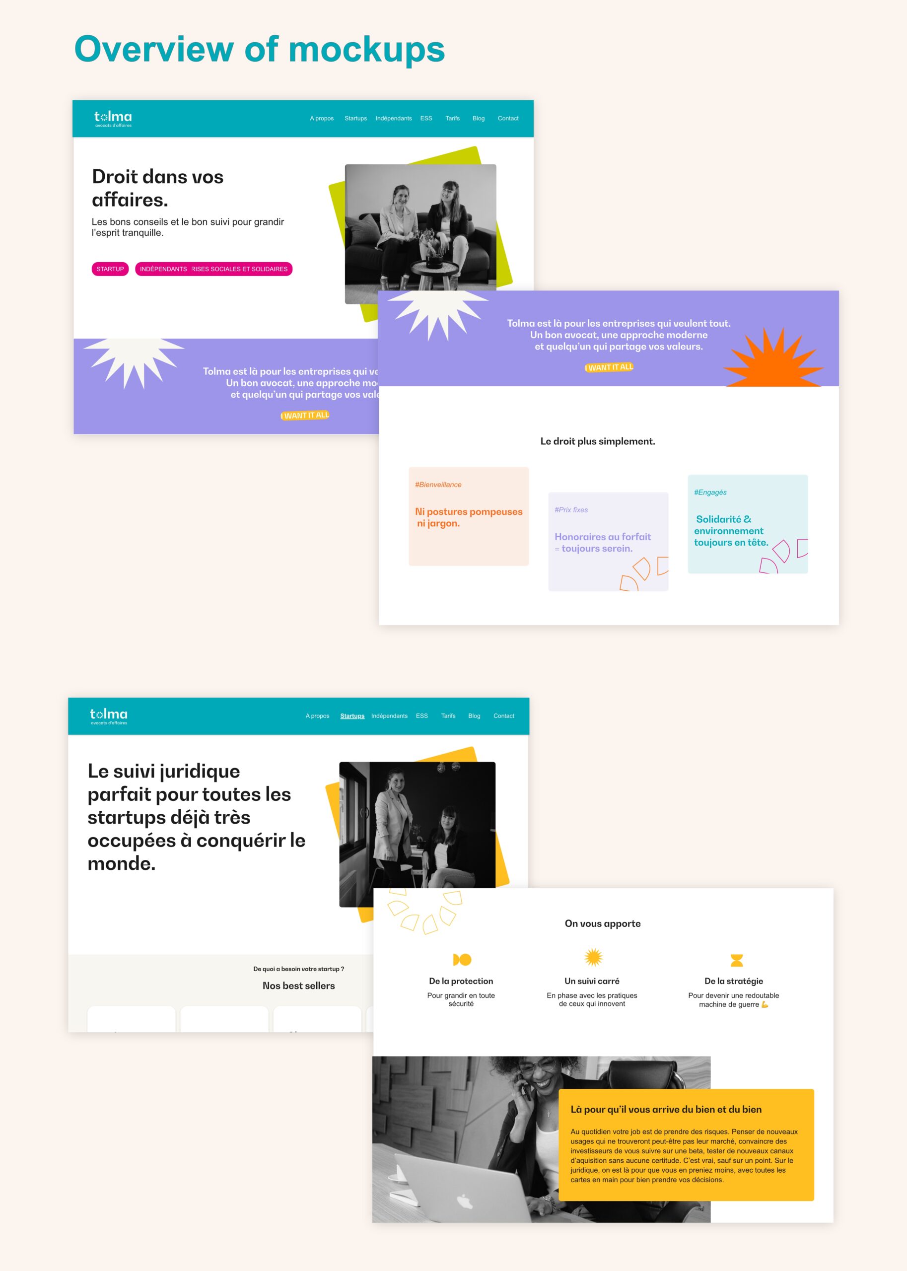
Application of the branding
After a graphic research phase, I used the branding to create a graphical universe consistent with the new visual identity and applied it across all screens.
To highlight the 3 different target users, I chose to apply a color from the palette to each page. This way, users can quickly identify the page they are on visually.
