Conception of the Uroquest mobile application
Pierre Fabre & AFU

Context
Problem statement
How to design a mobile application on urinary incontinence that is playful, fun, and intuitive for people who are not very familiar with digital tools?
Key project points
Target user group with limited digital experience
Consideration of technical constraints
Very tight deadlines
Creation of a fun and colorful universe
Project outline
Firstly, the urologists.
They provided me with the paper documents they had been using with their patients until now, their constraints, the elements to be included in the application, additional elements to add, constraints, etc.
Secondly, the target users. They are primarily people of a certain age with limited or no digital experience. This information is crucial as it had an impact on the user journey, screen structure, and particularly the choice of the graphic universe (font size, colors, etc.).
And finally, the development team. Given the tight schedule, we had to juggle with the schedules of each project member while strictly adhering to the iOS application guidelines. There was no creation or customization of components.


Screen design
Interface design and graphic universe
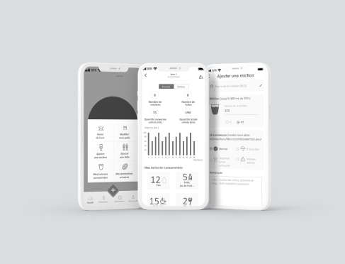
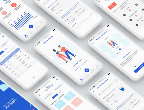
After some graphic research, I created a universe corresponding to the client’s requests and needs. In this project, there were significant challenges. We needed to create a pop and colorful universe with colors that resonated with users while recalling Pierre Fabre’s graphic universe (implicitly blue) without copying it!
The choice of a pop and colorful universe was a strategic decision by the sponsors. Indeed, they especially did not want to stigmatize users regarding their health concerns. The application had to be enjoyable for users while aligning with the graphic universe.
Once again, all this work was done in close collaboration with all project stakeholders.
This project was a real challenge, mainly due to the very tight deadline. We had to demonstrate rigor, adaptability, listening skills, and teamwork.

