Creation of the mobile application
Book Your Place

Context
Manon approached me to design her mobile application “Book Your Place.” It allows students to see real-time availability in their university libraries (BU) and enables the BU staff to manage workspace.
Key project points
User experience
Mobile application
Administrative interface
Startup
Objective
Develop a simple and intuitive mobile application
Design the administrative interface
User journey
Before diving into the application design, I conducted a co-design workshop with Manon.
Together, we mapped out the user journey for the mobile application. Additionally, we identified the necessary information for the BU management interface. This allowed me to identify all the screens to be designed.

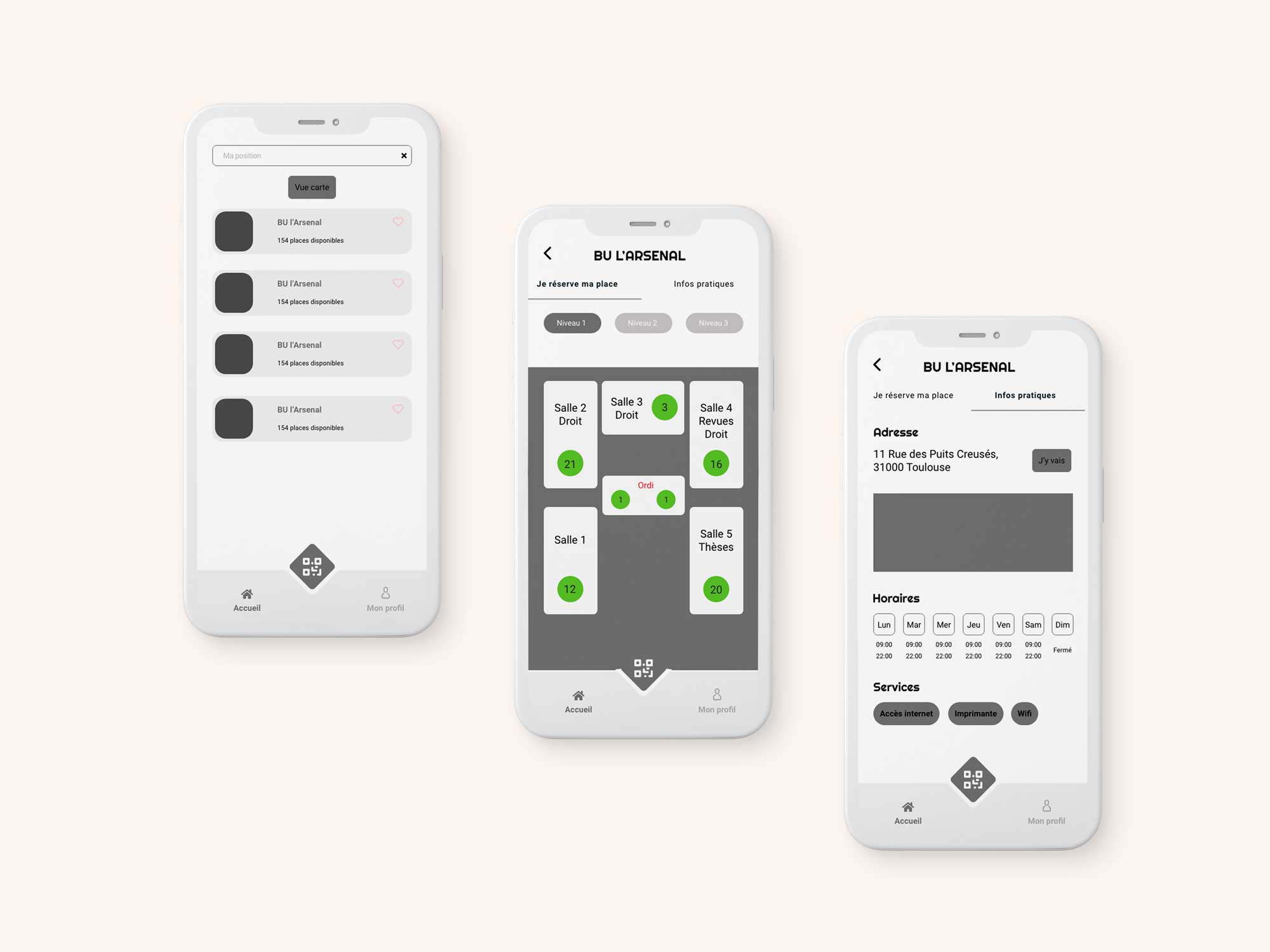
Mobile Application Design for Students
During this stage, significant work was done on screens displaying the BU floor plan and room details. It was necessary to differentiate between regular seats, those with computers, and those for disabled persons while integrating the concept of available and occupied spaces.
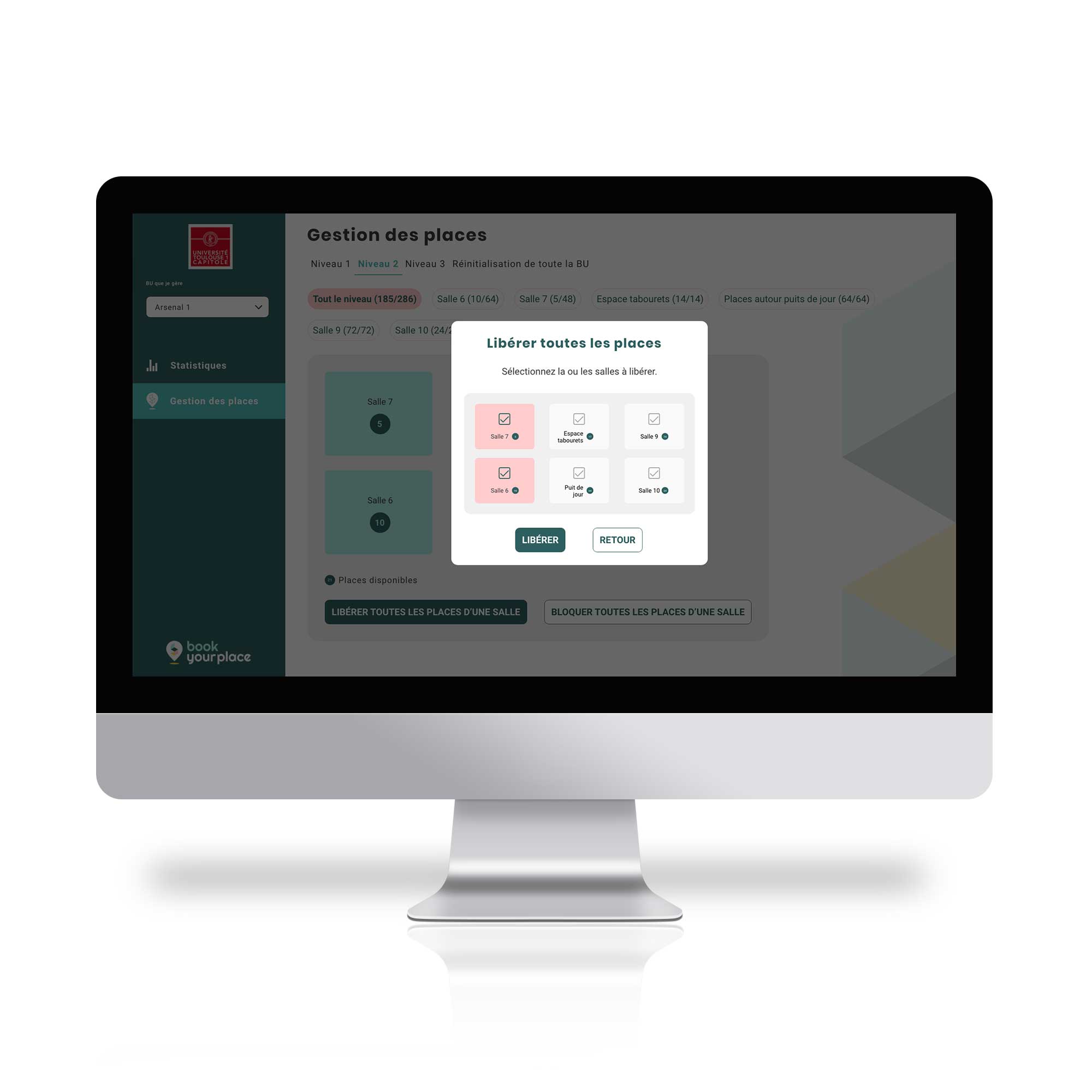
Designing the BU Management Interface
The second user of this tool is, of course, the BU manager.
An administrative interface for the BU needed to be created. It enables making a certain number of seats unavailable due to maintenance, for example, with just a few clicks. It also allows making all seats available at the end of the day.
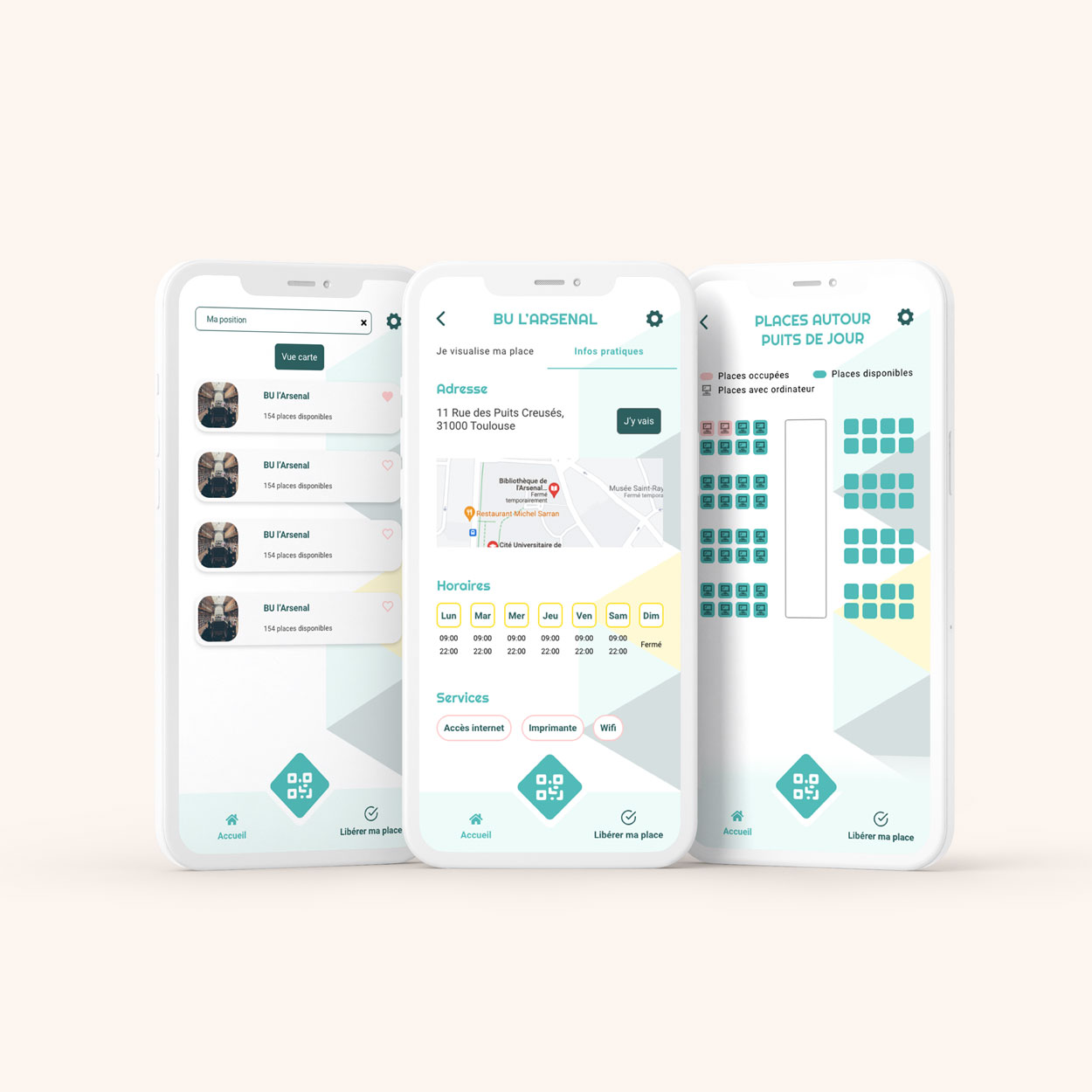
UI design
Based on the brand guidelines, I created a fresh graphical universe by playing with the opacity of the color palette and integrating the logo into the background.
