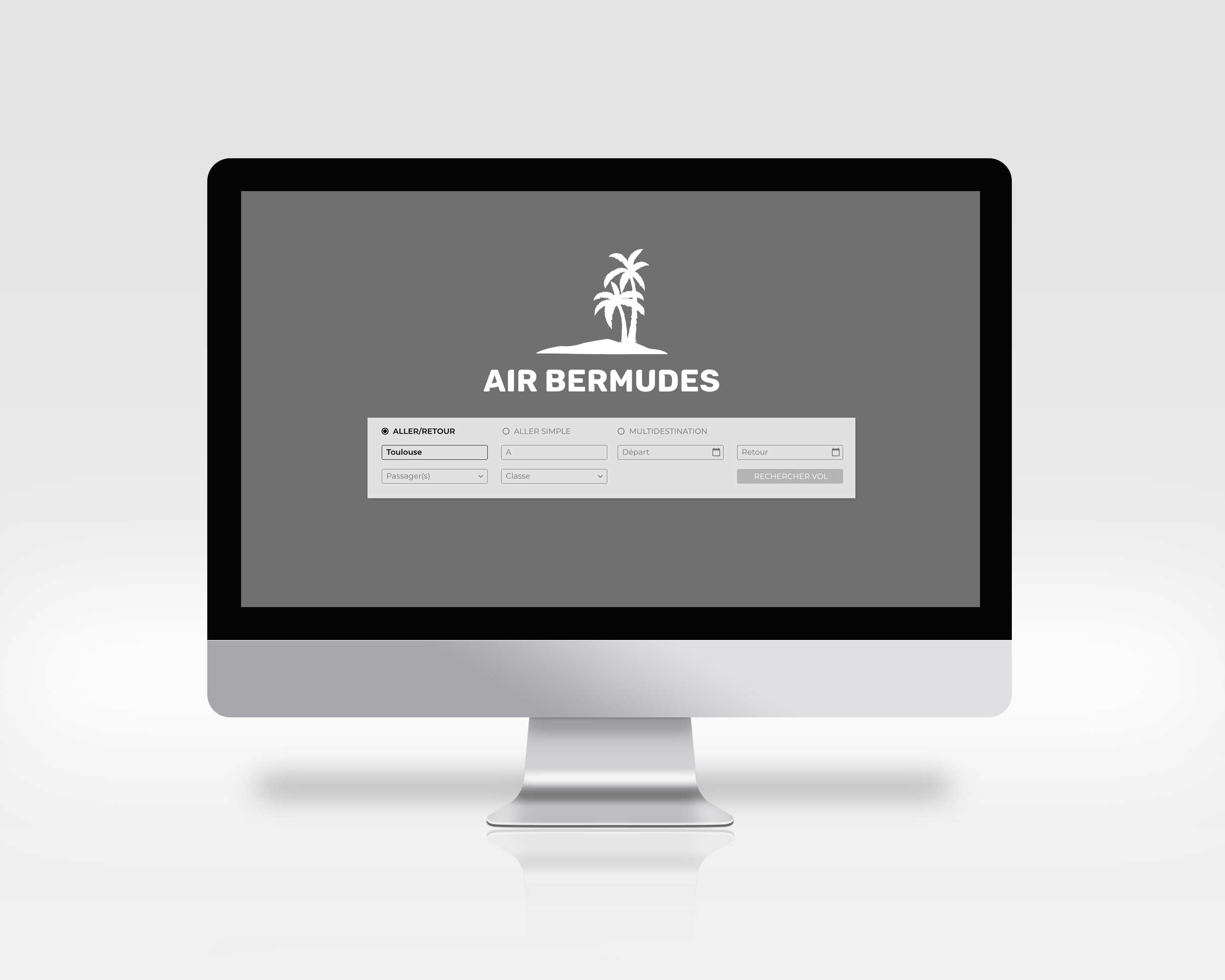
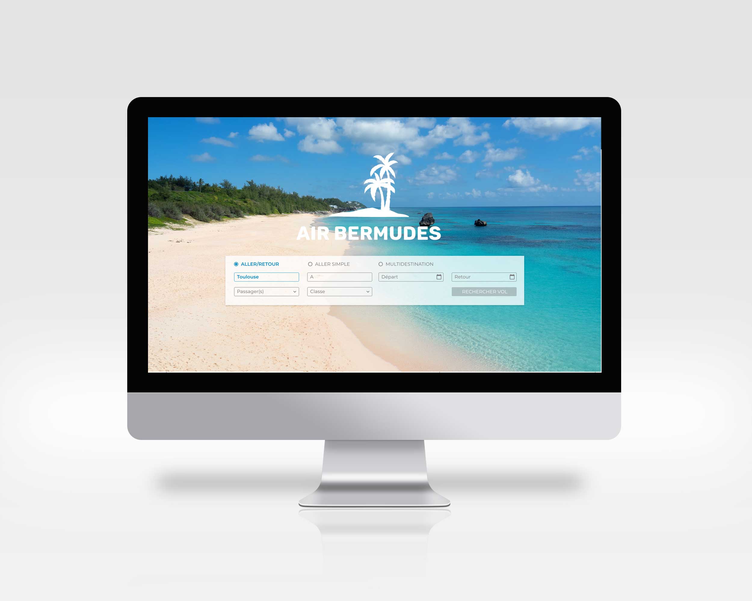
Flight Booking – Tourinov Web Service

Context
Tourinov Web Service specializes in developing websites for travel agencies dedicated to corporate committees.
The leaders of this company approached me for the redesign of a flight booking plugin.
At the client’s request, I changed the name of the travel agency and used a fictitious name.
Objectives
- Revamp the flight booking process by integrating a brand new feature: multi-destination booking to meet the needs of end users
- Create a “white label” design so that each travel agency can easily integrate its own graphic identity
Key Project Points
Responsive design
White labeling
Multi-destination functionality
Audit and analysis of existing system
To kick off this project effectively, I had extensive discussions and inquiries with the client. I supplemented my work with an audit of the existing system. This information gathering helped me understand their needs, expectations, and identify pain points in the current interfaces.
The redesign of these screens allowed for the integration of a new feature: multi-destination booking. This feature was identified as a user-requested functionality.
It allows users to book flights to multiple cities within a given timeframe.


Wireframing
After validating the user journey, I reworked the structure of the various screens.
By implementing the user journey, we were able to identify the “key” screens, such as the cart screen. This screen consists of multiple types of information. Properly structuring the different blocks was the first step in optimizing this page.
Interface design
After the wireframing stage, I proposed a design that could easily adapt to the colors of different travel agencies.
To achieve this, I conceived my design in terms of primary and secondary colors. Instead of deciding the button will be blue, I decided the button will be the primary color.
In addition to this, I played with colors, font sizes, and background colors to highlight important information or help structure screens effectively, such as the cart screen.

